House Tour: The girl room

Thursday, August 20, 2015

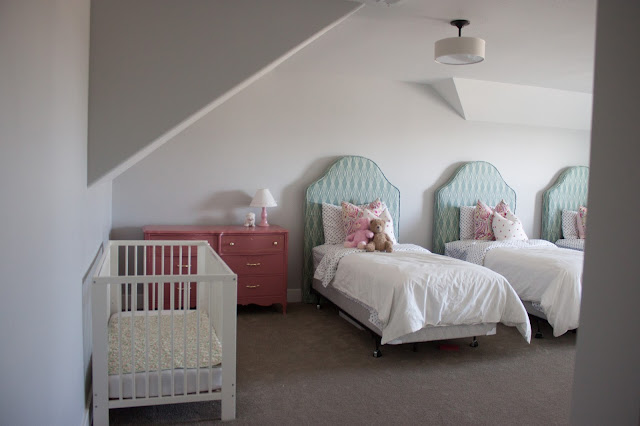
Here's Molly to show you around her room! The girls' room is upstairs, and since there's not really a single hallway in the house, the door is off of a landing type area off the staircase. Come in!
 Molly's crib is hanging out on the side of the room, and it will go away once she and Cora are both through with it. I just couldn't NOT put up all 3 twin beds, so there's that. Molly will move into her twin size bed when she's good and ready (the longer the better, please!) and then Cora will take her place in the crib. It's entirely possible that we may need to set up a second crib in here for a time, and I am totally fine with that if it means preserving my sanity a little longer! 
 The headboards were a super find at DownEast Home on clearance one day, and they came without slipcovers. They were originally from Pottery Barn, and you can buy them here. I was totally shocked that they had not two but THREE of these beauties so in typical Bri fashion I refused to leave their sides until they were bought and paid for and safely mine. The pink dresser came from KSL- it was under our TV in our old house, and it's right at home here. I've got plans for a cute little gallery wall made with mini things for above the dresser. 
 I made the slipcovers myself from fabric that I sourced from an ottoman at Target and an upholstered settee at Four Chairs in two different colorways. When you happen on that kind of find in multiple places and you keep liking it, chances are good that you're honing in on something you really like.
 One of the things on the to-do-very-soon list in this room is to hang the curtains. I have a set of white curtains, and I'd like to put on some fun large pom trim on the edges, probably because there's just not enough polka dot going on in here. :) The closet situation in this room is really really lovely- one closet for each girl! Molly on the left, Cora in the middle, and Abby on the end, just like the bed situation. Abby decided that they should be that way so that everyone can be close to new baby Cora. Sweetest. 
 This little wall is just begging for something fantastic. I think an area to display some of the crazy large amounts of art that come home from school might be just the ticket, or maybe a long mirror for extra primping space. 
 The polka dot sheets were a TJ Maxx find, and the pillows are down inserts from Ikea. I sewed the pillow covers myself. 
 I'm a stickler about keeping the toys in the basement, but these two teddys get to hang out on the bed. Other than that I'm pretty mean. 


 Abby's made herself at home here and I'm sure that Molly will quickly follow suite. 
Keeping things pared down in the kids' rooms has really made it easy to keep things neat and tidy. Really all they have to do is make their beds, clean up any laundry laying around and vacuum every once in a while. Happy kids, happy mom! 


House Tour: Piano Room

Monday, August 17, 2015

When you first enter our house, this is the room on your right. It's looking sad at the moment, but I thought I'd show you how it looks now and hopefully sometime in the next bit it will be semi-improved. Let me show you around! 
The blue couch was an overstock outlet find, and it was on extra sale the day we picked it up. It has a small small tear on the far left side, but you would have to be really looking for it to find it. Best part? It was $1200 regular price, and I picked it up for a cool $400. Sold! 
The two gold frames above the couch are in a holding pattern with some sad sad wrapping paper covering up old prints from the twin's nursery, but I'm actively looking for some new art for them. Buy? Make? Something else? I'll keep you updated. 
These navy chairs were an amazing Target shopping day find. They were originally $125 but were marked with a "repackage" sticker for $41 dollars a piece. I have basically no shame when it comes to basically free prices like these, so I asked a lady shopping near by who was off to fetch a cart to put an ottoman in to grab me one as well. You better believe I wasn't letting these guys out of my sight. I've got a curtain rod to hang here, just as soon as I select the curtains that I want for this space, which will really help fill in this empty looking wall. 
Well, this is turning in to a clearance finds only post, but that is sort of the best. This little side table was at Hobby Lobby, originally $140, but I walked away with it for $14 dollars. FOURTEEN DOLLARS! It's on the short list for a paint job (maybe gold? maybe not?) and then I'll need to shop for some accessories to style it. And pillows!

 This frame is slated to be changed out, but it depends where I head with the other two gold frames. Maybe I should just start calling this the gold room? Probably yes. Also, yes, there are outlets in the floor. This room was meant to be an office when we were building the house, but then we switched things around a bit and so here we are. I'll be picking out a rug :)
 Also on the list for this room is a solution for music storage. The brown cardboard box we're sporting is inexpensive, but isn't the classiest thing ever. 
 Here's the view looking back towards the front door (straight through the wall). I'd like to put something really fantastic and probably sassy on this wall that you don't see unless you're all the way in the room.
 And there we have it! Another blank wall, beyond the blank walls, because that's what phase of this house we are in right now. Actively moving toward more design all through the house, but loving the blank slate that it is in some places for now. 


Pillows for everyone!

Friday, July 31, 2015

Well hello there! If you're here from Meg and Lex, co., welcome! If you're not, you might want to head over there and see what we cooked up for Lexi's living room, and then mozy on back here. 

I showed you one formula that we used in Lexi's living room, and here are three more that would also work for her room, in varying levels of neutrality and color. Ahhh pillows. One of my very very favorite parts of any room. There are so many options out there it is just so hard to choose. 

I promised to share my very favorite pillow tip that I am LOVING right now, so without further adieu: 
There are pillows, and then there are down pillows. Down pillows are so much more comfortable and amazing and they sit so pretty on the couch that it's easy to tell the difference between the real deal and it's cousin imposter- the polyester fill. So, what are you to do if you've fallen for something with the dreaded poly-fill (looking at you, number 3!)? Find the sewn line where the pillow was sewn closed, and take a seam ripper and pull all of that stuffing out. Sew in a zipper instead of the stitched line and fill the pillow with a down insert instead. Now you've got yourself a down pillow (win!) AND a washable pillow cover than you can switch out at will as well (double win!). 

Happy pillow shopping, friends! 
Sources:

Tile Update!

Thursday, July 30, 2015

Here was our sad sad drywall hanging out pre-tile. I'm so happy to tell you that that view is looking different now!
 
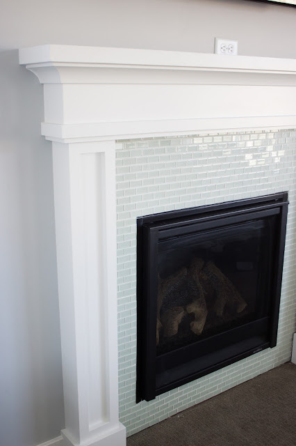
We went with a tile called Arctic Ice, a glass 1x2" subway tile from our local tile shop. It brings a nice subtle color in to the living room and it's totally better than those uneven paint lines that the painters left when they sprayed the mantle and masked off the fireplace box.


 The color is pretty, but the shine and texture is better. It's understated and pretty and I'm so jazzed about it! 
 I measured out 10 square feet of area that needed tile, and we ordered 12 square feet total. The industry standard for overages is 10%, but since this is our first tile job we decided to pad that number a little bit. In the end we really did end up using just 11 square feet- right in line with the 10% overage. We still need to tile the floor beneath and caulk the edges where the tile meets the mantle, but so far it's looking a million times better than before. 
A pulled back before and after you ask? You betcha. 


The post where Lexi gets upgraded from 3 plastic plates.

Tuesday, July 21, 2015

You may know a few of my favorite ladies, Meg and Lex, the beauty geniuses behind my eyebrows and their vloggy blog Meg & Lex, co. A few weeks ago we spoke about getting together to style Lex's open shelving and last week we got together and made it happen! I'm all kinds of excited to show you how it turned out. One of my favorite things about designing for clients is honing in on someone else's style and delivering it to them, and this one turned out to be exactly Lex in a shelf form, if there is such a thing. 

We captured the whole process, and Meg and Lex did their Hollywood magic so that you can watch it all unfold HERE! I'll wait here while you go check it out :) 

Good thing Lex needed some cutting boards! I love how much warmth the wood brings to the whole collection. 
 Can I tell you a secret about the smaller of these two fabulous mercury glass vases? It has a terribly unfortunate seashell on the "front" of it, but it was on clearance for $5 so we just turned it around to the back and voila! Fabulous. 
 This little unicorn I believe is meant to be a ring holder for jewelry, but it's the perfect amount of quirky to add here on the plates, which otherwise can look a little too stuffy and boring on their own. 
 I am so glad we were able to use this fabulous cake stand. Confession: I go to Home Goods probably an unhealthy amount. I found this guy on a previous trip and when it was still there when we went shopping for Lex's project, I was pretty thrilled. The color of the wood is so pretty! 
 DI books for the win! Cheapest way to get books... just have to do a little digging.
 This basket was another great deal of the day... only $8 and it has such a great patina. 
 These succulents are 100% fake, which is great because on the far side of the shelf it would be annoying to have to pull down to water all of the time. I'm loving the rope detail on the planter as well.
 I'm crazy about these bowls. The texture on them is so pretty and it's just enough. Not in your face, but still holds its own. We found these dish towels in this grey stripe and also navy stripe, which was tempting. In the end I'm so happy with the grey because it looks amazing with the paint color that we selected earlier this year (Sherwin Williams Worldly Grey).
 Love love love the balance of wood and ceramic and metallic, while keeping everything so cohesive. 
 Originally we were planning on placing some Pellegrino bottles here, but it seems they have switched to plastic bottles (at least at the shops where we were- we later found the glass bottles at Costco!) but I'm actually a lot happier with these bottles for Lex's space. The labels have both gold and silver, and it does such a great job of marrying the gold from the shelves with the mercury glass. 
Sources:
Mercury glass vases- Home Goods
Books- DI
Gold Sea Urchin- Hobby Lobby
Wooden Cake Stand- Home Goods
Wire Basket and Linens- Home Goods
Mugs- Home Goods
Picture Frame- Home Goods
Ceramic and Rope Planter- Target
Succulents- Hobby Lobby
Ceramic Bowls- Target
Plates- Tai Pan
Unicorn- Home Goods
Tonic Water- World Market
Wood Cutting Boards- Home Goods


Pull up a chair, friends.

Thursday, July 16, 2015


I've been on the hunt for a really fabulous pair of occasional chairs for a client project, and I thought I would share a few of my findings here in case you're looking for something similar, or if you just like perusing fabulous seating options like I do. These 5 chairs all have a little something that sets them apart from each other, and it really depends what you've got in the rest of the room that determines the best fit. For my client, I'm leaning toward option 2 for her formal front sitting room, but I'm holding myself back from buying one of each to keep all for myself! Now the hunt for the perfect rug and side table to pair with it! 
Sources:

Things people do that they should stop doing.

Wednesday, July 15, 2015

A few weeks back, a friend of mine came over to see our new place, and she asked me "where is all of your stuff??" and I was like, "ummm... right here?" and then I realized that my efforts to declutter and streamline ARE WORKING! It's so freeing. At the same time, I'm working on layering in more decoration and design and accessories in my home, which is where you can really go wrong. Here's the secret friends. Don't buy ugly things. Seek out the things that you want to be looking at on the regular, because you ARE going to be seeing things on the regular. Notebooks, backpacks, your kid's shoes... all of it. I get it, houses get messy. I mean, I really get it. So, let's all do ourselves a favor and stop settling for ugly things. And, lest you think I'm advocating that you go bust your budget for silly things that you can't even take to heaven, I'm totally not. And so, a tale of soap dispensers. 
 These dispensers, actually. I had been on the hunt for soap dispensers for a few months, ever since we moved in really. Most that I found were in the $10-$15 range, which is fine. I didn't find anything that I HAD TO HAVE, so I just didn't buy anything. Then, one magical day in HomeGoods (where all magical days begin, really) my girl Meg found these beauties on a shelf for five dollars. FIVE DOLLARS! So, the lesson. Beautiful things always, be picky, be thrifty, be diligent in shopping always. 
 I mean, if you're going to have a candle, buy a pretty one. Right? By the way, this one smells AMAZING. It's Target's knock off of Anthro's Volcano, if you aren't already aware of it. The packaging has changed since I purchased this one, but you best believe I'll be buying an update when this one is all out of wax. 
 This is my centerpiece on my table currently, and this is a notebook is one that I picked up the other day. I don't hate it when I leave it out around the house, because pretty! 
 One last one just to really drive this silly point home... I LOVE this planner that I picked up at Christmastime last year. It's minty and gold and it's going to match my fireplace tile so well- ha! Seriously though, it's consistent with the styling through the rest of the house so it feels intentional and not messy. 
 Maybe I should start my search for a new one for 2016 now? Probably yes. Happy shopping friends. 

Proudly designed by | mlekoshiPlayground |